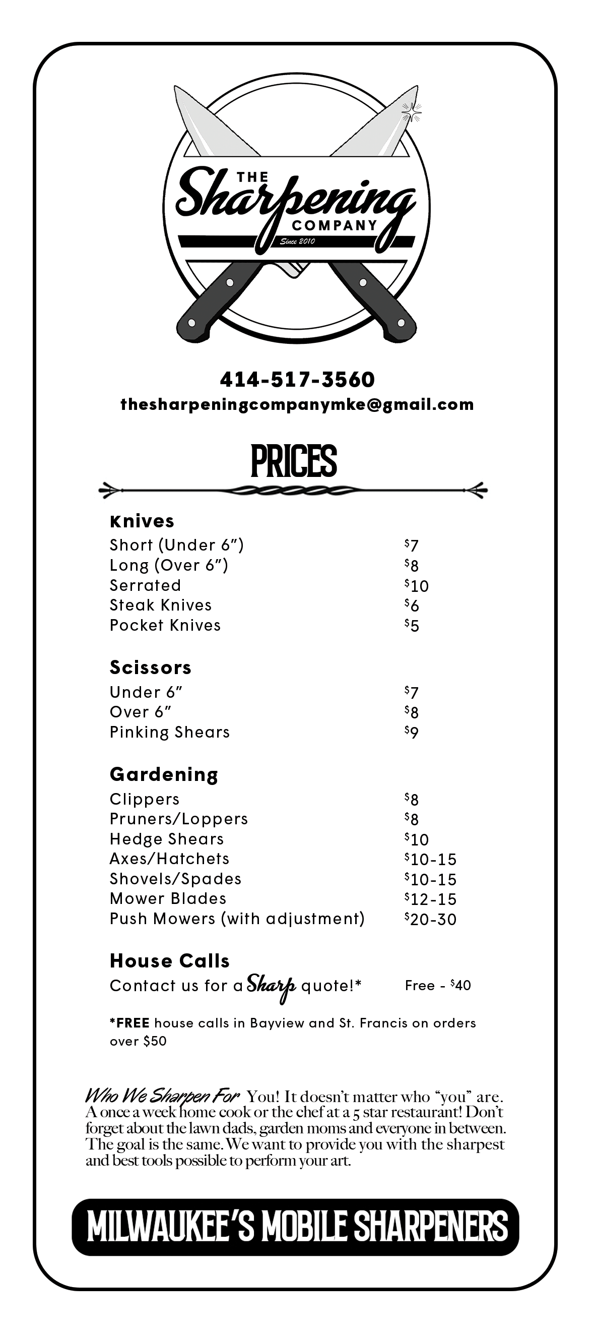
The Sharpening Company
The Sharpening Company is a local business that specializes in knife and blade sharpening. They primarily do kitchen knives but also do everything from gardening tools to mower blades.
inspiration + influences
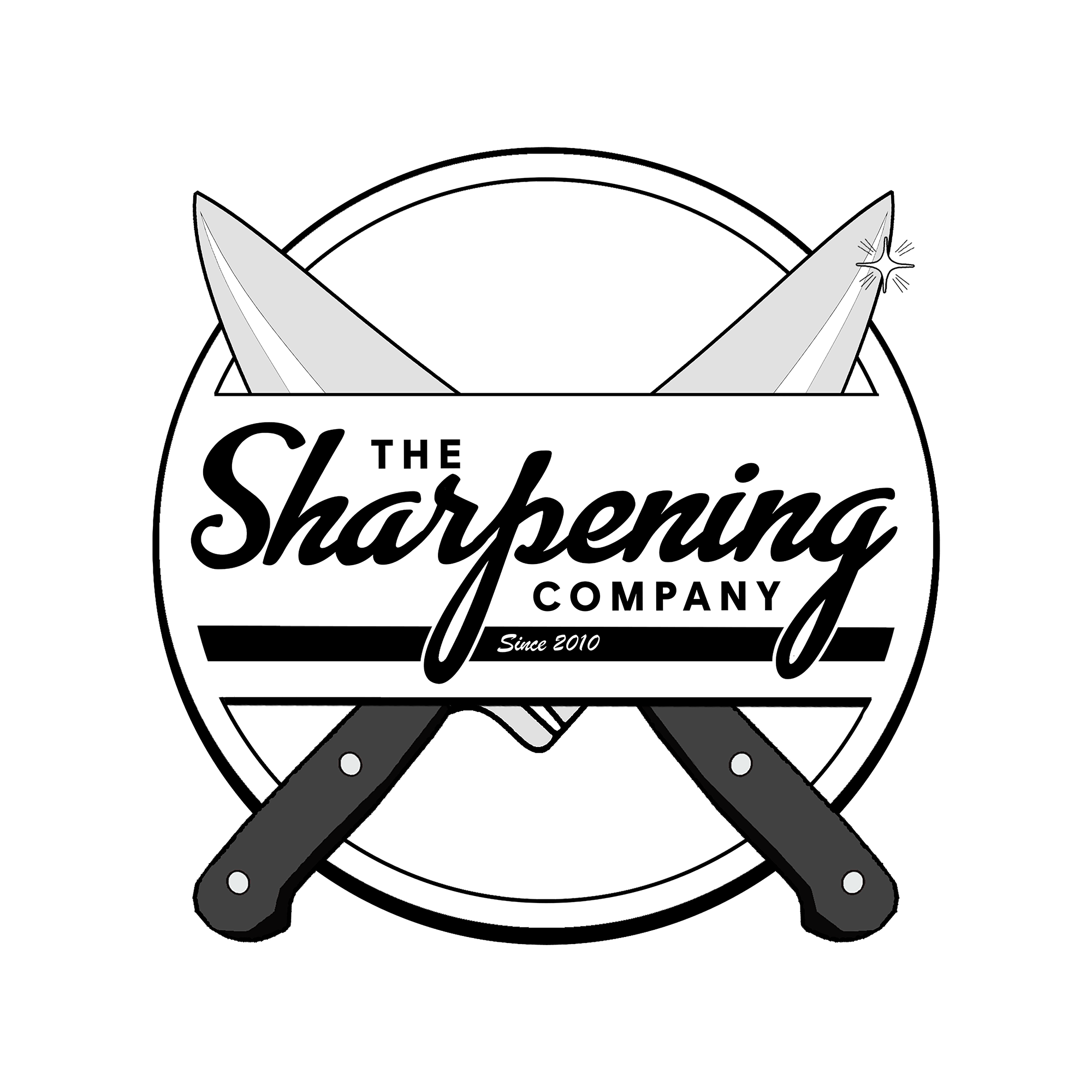
talking to the client, it was clear that he was very aware of his client base which was made up primarily of bayview residents. Bayview is a neighborhood in milwaukee that features a lot of retro signage, a lot of the businesses haven’t updated their signage in many years. he wanted his logo to share this aesthetic.
the creation of the logo

This logo went through several rounds of looks. we started out wanting to do a logo that featured two intersecting tools: a butcher’s knife and a blade sharpening rod.
the logos on the left are an early concept to mirror the look of a boyscout merit badge.

we decided on a vintage hubcap style shape (Featured on the right), or “the old coin” as we called it, with cutouts to have the knives weave in and out. the types chosen definitely mirror the early sixties look of a lot of the local bayview businesses as well. for that added retro touch, i added a sparkle to the tip of one the blades. this gives the inference that the blade on the left is dull and the blade on the right is sharp.
graphic assets
once we had the logo there were quite a few assets to make, including a price list, business cards, banners, etc. we talked about making the price list look like a menu which helped align The sharpening company with its customer base; mostly service industry chefs and prep cooks working in bayview restaurants. throughout all of these assets, we kept the same retro bayview-specific look.