Gloss Records
Gloss Records was a record label that operated in Milwaukee, WI from 2014-2019. The company adopted a boutique spin on their short-run limited edition physical products. In 5 years they released 35 records on either vinyl or cassette.
inspiration + influences / the creation of the logo
i was a partner in gloss records so i had a hand in the look from the very beginning. like all labels, our first and foremost goal was to be “cool.” but there are so many variations of cool it was hard to decide what kind we were shooting for. i asked myself “what is our product?” the answer: limited cassette and vinyl releases with a focus on unique packaging. we also decided we wouldn’t be a genre label. we would put out anything we thought was good. so from the very beginning there was a potential design dilemma. different bands have diverse looks and visual vibes. we needed a simple logo that would look clean on anything.
the initial idea to was to look high end, even though we had very little money. so i looked at the top fashion brands. as you can see, I was very drawn to the hugo boss logo of a bold serif typeface with a thin sans serif below.
i also looked at other record label logos for inspiration but it was ultimately the fashion logos that provided the sophisticated touch we needed. i added bars in-between the bold serif letters in “gloss” to denote a surface. as if the four fingers of your hand are pawing at the glossiness. my partner said it was a subtle nod to the bars of the band black flag’s logo as well. we were, after all, punk in ethos.
packaging design
now that we had a logo, we set about prepping our first run of releases. we had three artists with very different visual flavors and all of these records were being released on cassette. we needed something that made it not just a crappy tape. we found out from the pressing plant that for a dollar more per tape we could get a slip cover printed that would slide over the cassette. that seemed to be a very cheap way for us to make these little cassette tapes appear as a more premium physical product. it was also a way to make things that were very dissimilar in look feel the same.
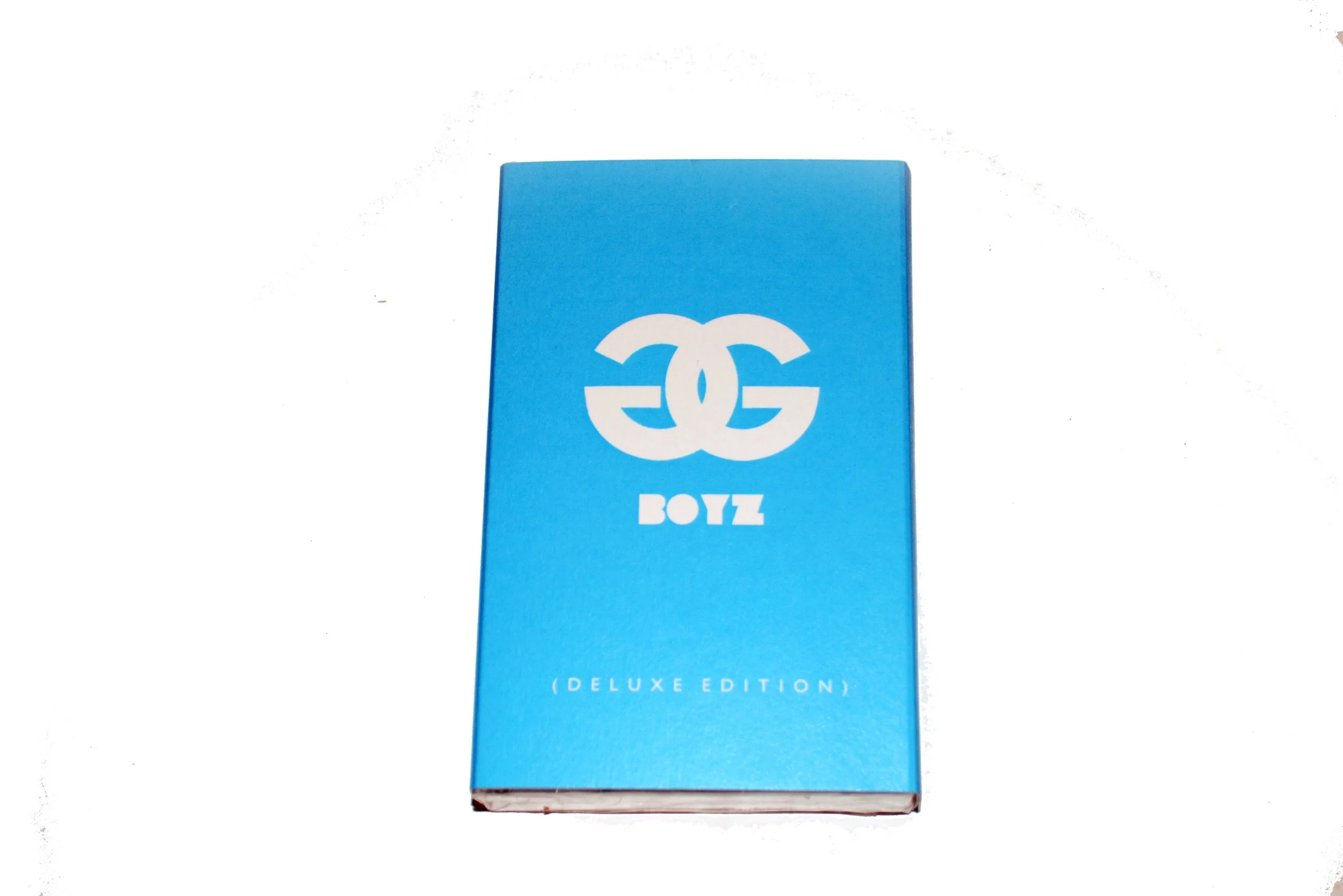
the examples below show the product unopened on the top row, the second row shows the cassette with the slip cover taken off and placed next to it. the last row is a close-up thumbnail of the back of each release with the logo.
it’s funny to note that the band GGoolldd’s logo was a riff on the gucci logo. such synchronicity!
gloss weekend (music festival)
we started churning out more and more releases and decided to have a one year anniversary party. we initally came up with “gloss records’ lost weekend” but it seemed really overwrought. especially when the brand was all about sleekness. we shortened it to gloss weekend since “gloss” almost sounds like “lost.” after a successful first year we did it two more years after that. the fourth year was in the planning stages but fell through.
Misc Gloss events, press, promotion and more releases
this is a gallery of different gloss ephemera. posters for events we put on, press clippings from interviews done by myself and my partner joseph peterson, as well as some more of our releases. because of the effort we put into our branding, our very small niche company had a strangely elevated profile throughout it’s brief existence.


