

America’s Rock N Roll Circus
America’s Rock N Roll Circus is a music festival that’s held in Kenosha, WI. It’s inaugural year featured 10 bands from all over the US playing an all-day festival in downtown Kenosha.
inspiration + influence


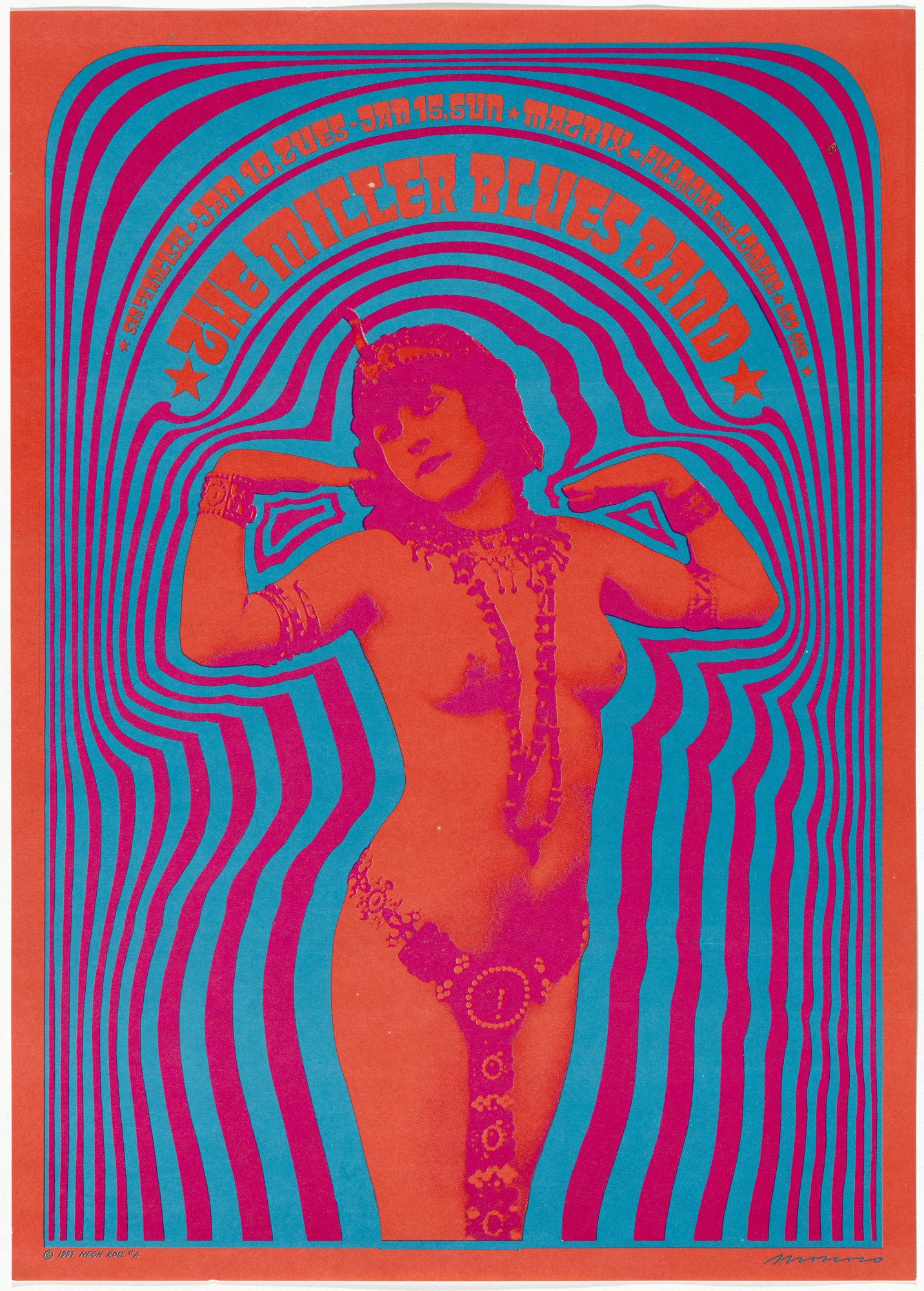
the festival was put on by members of Kenosha band Lunde. they were inspired by famous rock city festivals like woodstock and monterey pop as well as the rolling stones’ rock n roll circus film. these influences as well as the psychedelic design work of 1960s graphic artist victor moscoso played a large part in my design work and branding for their festival.
the creation of the logo

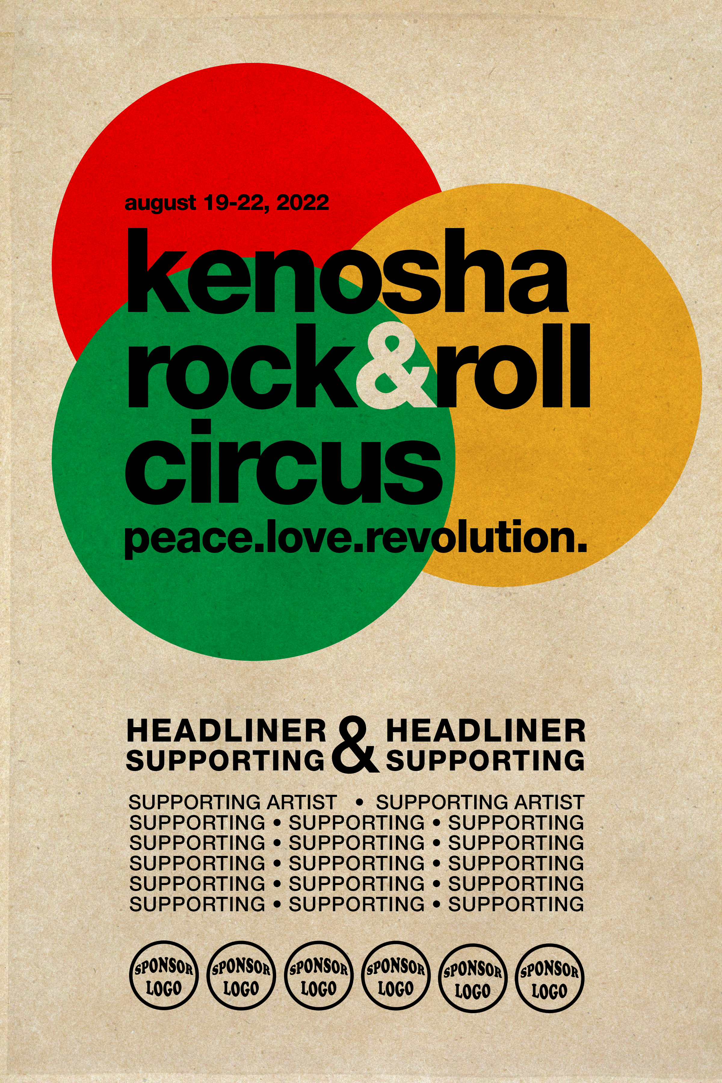

the festival was originally called Kenosha’s rock n roll circus. kenosha as a city was under a microscope and in the national news throughout 2020. the organizers wanted the festival to promote peace, love and revolution much like the original woodstock festival did during the vietnam war era.
i tried to throw out all of my first ideas involving any outright circus themes. no clowns or big tops. so i started thinking about three rings, like a three ring circus, and how that could make up the logo.
these three examples showcase this three ring idea in vastly different executions.

once the festival started booking national acts they wanted to change the name to America’s rock n roll circus. i kept the three red rings of the first option, switched out the type, and added a psychedelic explosion in the center of the rings which made the illustration feel three dimensional.
promotional assets
after finalizing the logo, we made a barrage of graphic material for promotional, informational and logistical purposes. from left to right, the top row features the announcement poster, the teaser poster, and then the official poster featuring a hippie hitchhiking holding a kenosha sign. the next row features the festival passes for artists, press and staff. the third row showcases the individual artist’s playing that were posted on instagram. the last image is from the homepage of the website.


