KAYCO Home & Office
KAYCO is a maintenance and repair business located in Richmond, VA. They specialize in plumbing, electrical and general repairs.
inspiration + influences
on our first meeting, the client was saying how his newly formed company needed to look trustworthy. it needed to look like a mom and pop type place that had been passed down through generations. in his option, that was the look people trusted because that’s what customers looking for a plumbing or electrical repair company expect.
After doing some research, the client and i noticed that a lot of the logos for tool companies and repair companies had the aesthetic he wanted. most of these company’s logos were made in the late sixties or seventies and hadn’t been updated since. so looking at more and more 70’s logo design, it was all big and clunky.


the creation of the logo
after doing different sketches using minimal shapes to depict a “K,” i decided that the letter by itself won’t work because it will always scream k-mart. so instead i wanted a typeface to do some of the heavy lifting.
the second example below shows something closer to what i was looking for. I wanted the lettering to scream that era but also was searching for something rounded to evoke plumbing piping.
we also started batting around a color scheme. sticking to orange and brown, we were hinting at something that was extremely 70’s but also masculine.

the finalized logo got rid of the brown and went with straight black. the type was still round like i was looking for but i started experimenting with the shape of the logo interacting with the text. the “k” and the “y” both break the line of the logo shape. this felt right in the middle of what i was looking for, something that evoked the companies we were inspired by and also that retro flavor.
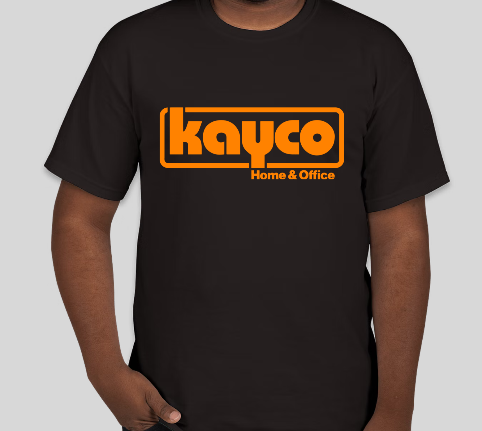
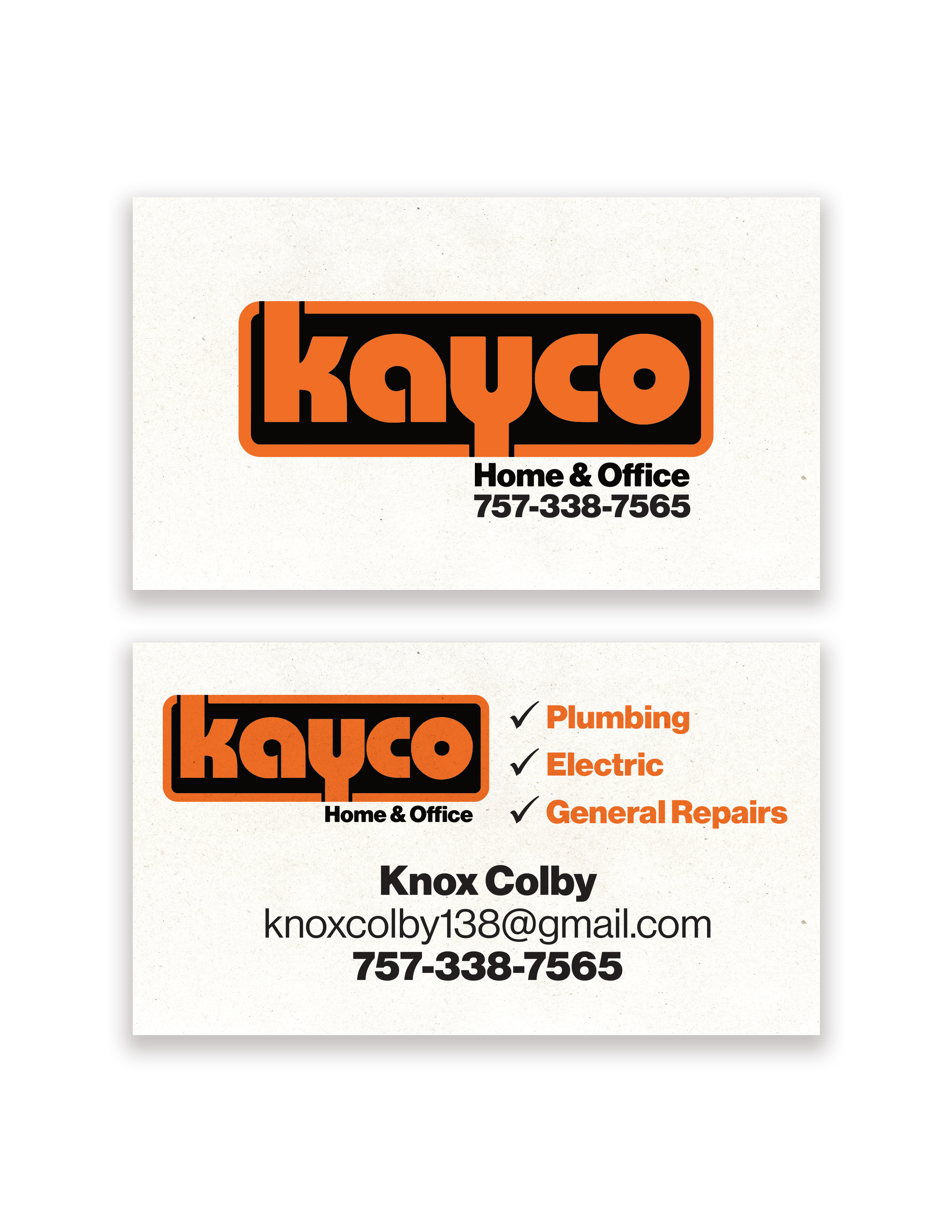
more company collateral
below are a company t-shirt, an invoice, and business cards.